abel is evolving
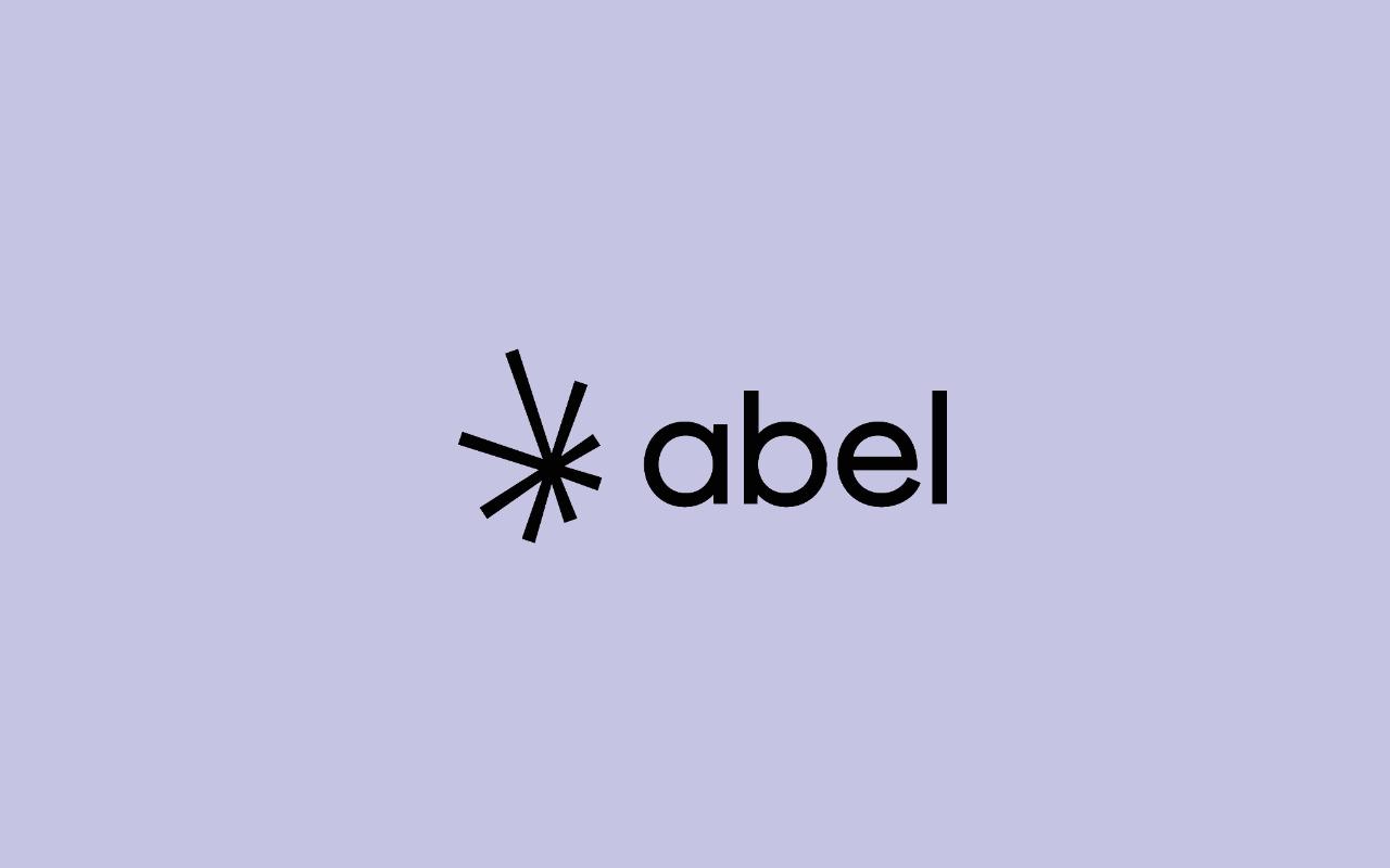
The starting point of our existence is light. So we chose a strong symbol for our new logo: the shape of a star.
This sign represents light rays and we can also see other meanings: the traits combine to form a whole, it is a symbol of cohesion, of the association of several skills. We form a solid network thanks to our partners and prescribers.
It’s a logo that shines. The spokes are of different sizes and this makes the whole thing more dynamic. The letters of abel are constructed from almost perfect circles. There is balance and roundness in the typography. Readability inspires transparency and conveys the idea of proximity and rigor, which we wanted to maintain. What we have wanted to establish over the years is trust and the ability to innovate.
We have 3 new colors, in addition to white and black: lilac recalls the sky, terracotta red, which is a deep red remains a standard at abel, and linen brings softness and sobriety and makes the link with our choice to respect environmental considerations in the design of our products.


